Project
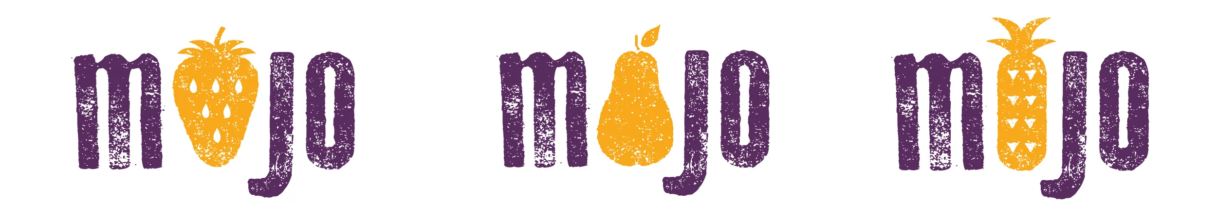
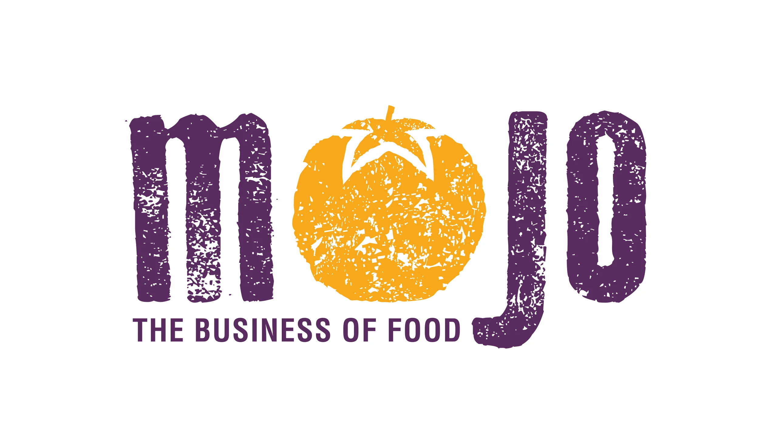
Founder Jo McGarry Curran envisioned a strong, vibrant color palette, combined with a youthful and "not too corporate" style logo to portray her company's enthusiasm and progressive food industry knowledge. I presented a few different variations of produce within the logotype. After careful consideration, the tomato version was chosen based on it's cultural significance. Tomatoes commonly signify prosperity and good fortune, which made the most sense for MoJo.
Client
MoJo is a consulting agency that serves the local food industry in Hawai'i. Their expertise lies in connecting landlords to potential restaurant tenants, investors to operators, farmers to chefs and media to the next big culinary story.
Located in Honolulu, HI.
www.mojomcgarry.com
Designed under the employment of Osaki Creative Group.
PRELIMINARY DESIGN CONCEPTS
FINAL PRIMARY LOGO

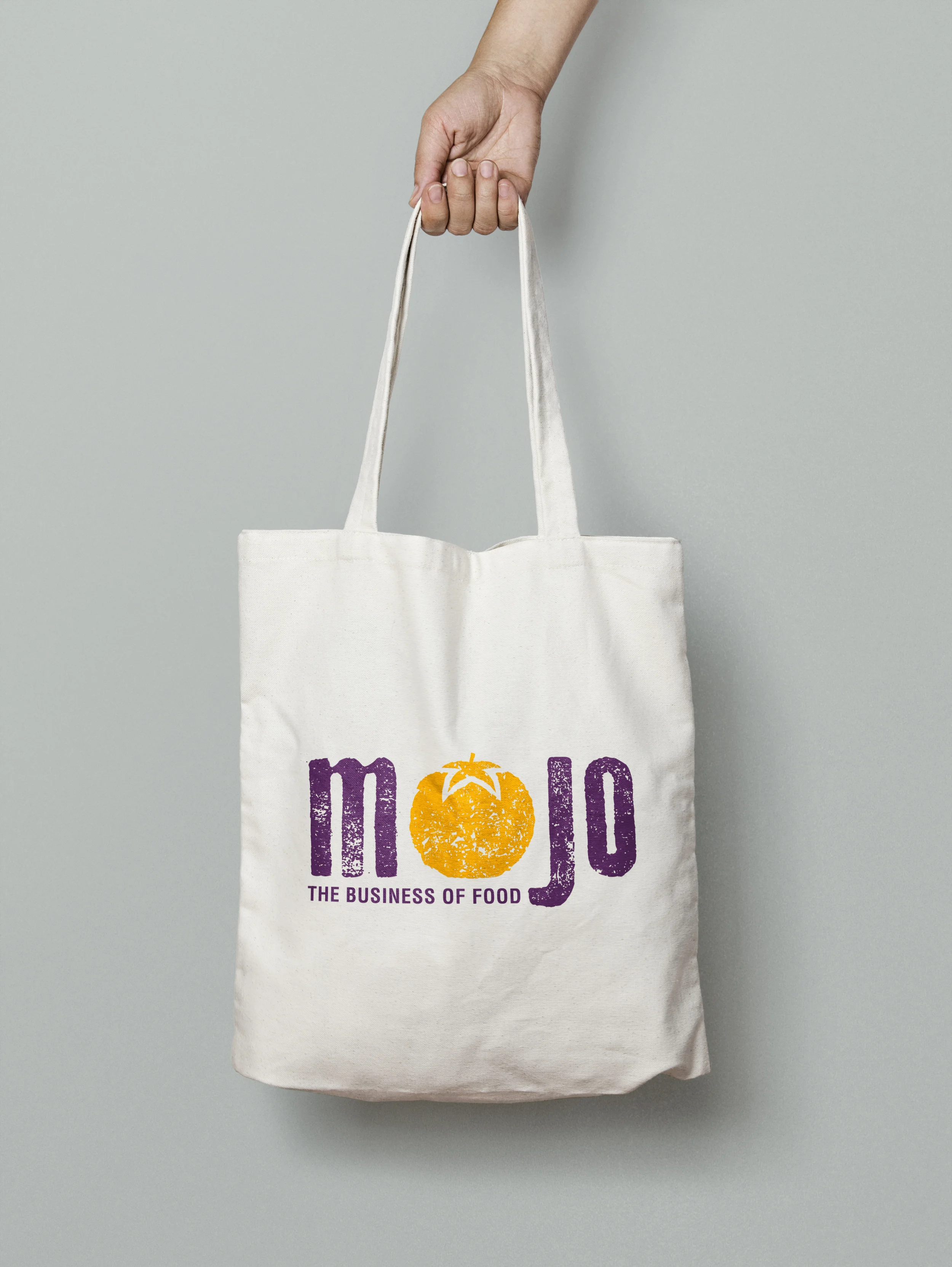
APPLICATIONS