Project
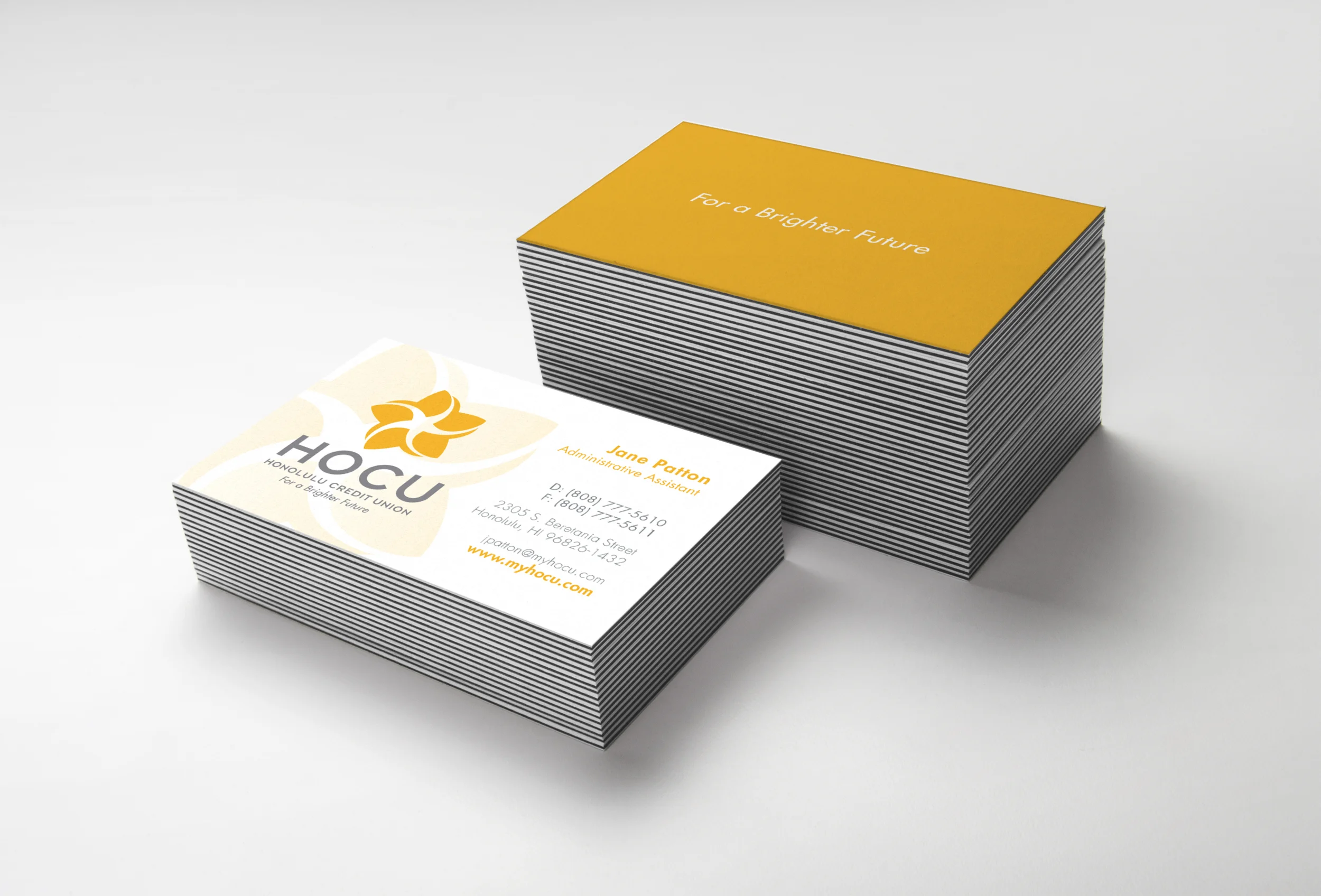
Formed nearly 80 years ago, Honolulu Federal Credit Union wanted to refresh its identity. They started by simplifying their name by using the acronym HOCU. I decided to design a mark playing off that name as "hoku" translates to "star" in Hawaiian. The final mark is a star stylized as a flower to lend a fun, island vibe, while still emphasizing it's traditional Hawaiian roots.
Client
Honolulu Federal Credit Union was chartered in 1936 as a financial cooperative for U.S. federal employees employed in Honolulu. It was the fifth credit union formed in what was then the Territory of Hawai‘i. Today, HOCU has more than 15,000 members with assets of over $231 million, and is served by 40 employees at four branches.
Located in Honolulu, HI.
Designed under the employment of Osaki Creative Group.
PRELIMINARY DESIGN CONCEPTS
FINAL PRIMARY LOGO
SECONDARY LOGOS
APPLICATIONS


